Responsive Web Design

Year: 2014
Manufacturer: Fronted Masters
Manufacturer Website: frontendmasters.com/courses/responsive-web-design/
Author: Ben Callahan
Duration: 2+ Hours
Type of material handed out: Video Tutorial
English language
Description: From smart phones to tablets and even 60 "HDTV sets, your site can be viewed everywhere on almost every device. But is your site built to respond for all the different size and display options? A pioneer in responsive web design, Ben Callahan, leads you through the process of what it means to build a web site in the 21st century. Ben tackles RWD process, prototyping and patterns down to specific coding tactics with media queries and responsive CSS.
Introduction
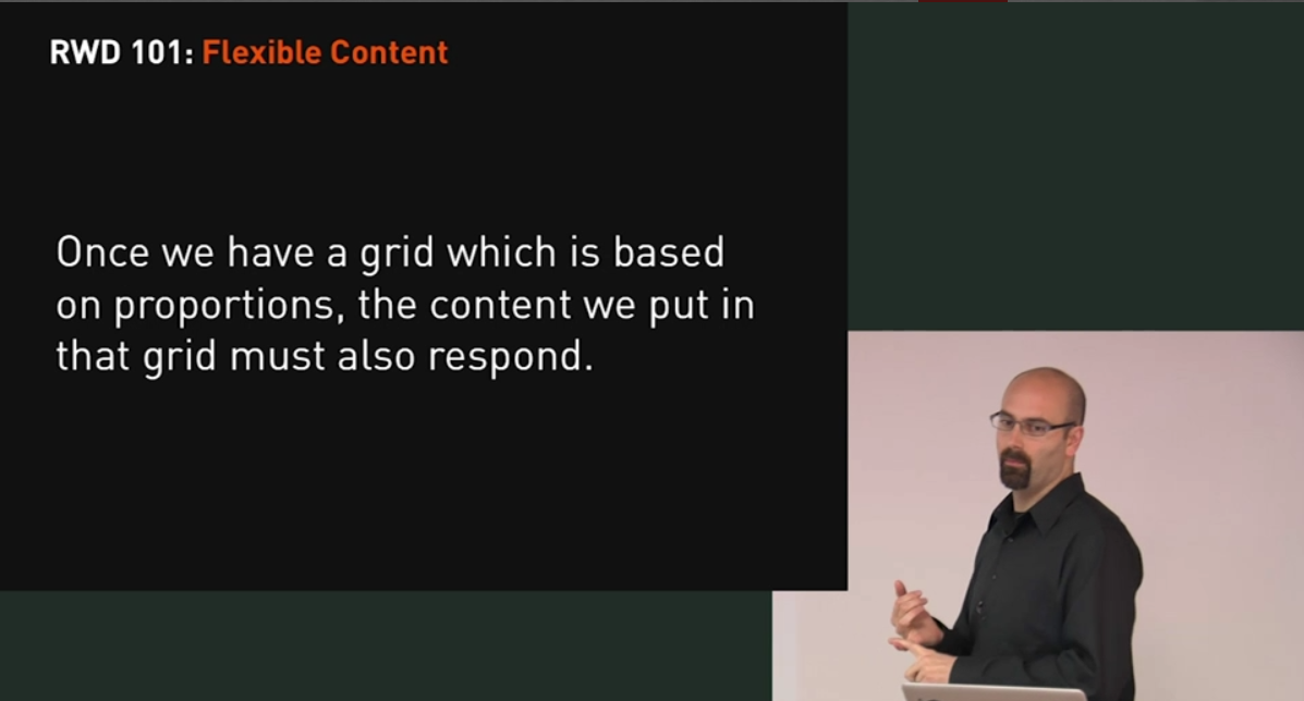
Part 1: Responsive Web Design (RWD) 101
Part 2: RWD Process
Part 3: Applying RWD Styles
Part 4: RWD Retrofitting
Part 5: JS to the Rescue
Part 6: Lessons Learned
Part 7: What’s next in RWD
Example Files: None
Video Format: MP4
Video: AVC, 1280x720, 16: 9, 30.000 fps, ~ 1359 Kbps
Audio: AAC, 48.0 KHz, ~ 96.0 Kbps, 2 channels
From smart phones to tablets and even 60″ HDTV sets, your site can be viewed everywhere on almost every device. But is your site built to respond for all the different size and display options? A pioneer in responsive web design, Ben Callahan, leads you through the process of what it means to build a web site in the 21st century. Ben tackles RWD process, prototyping and patterns down to specific coding tactics with media queries and responsive CSS
1.08GB